branding & Identity // britannia restoration
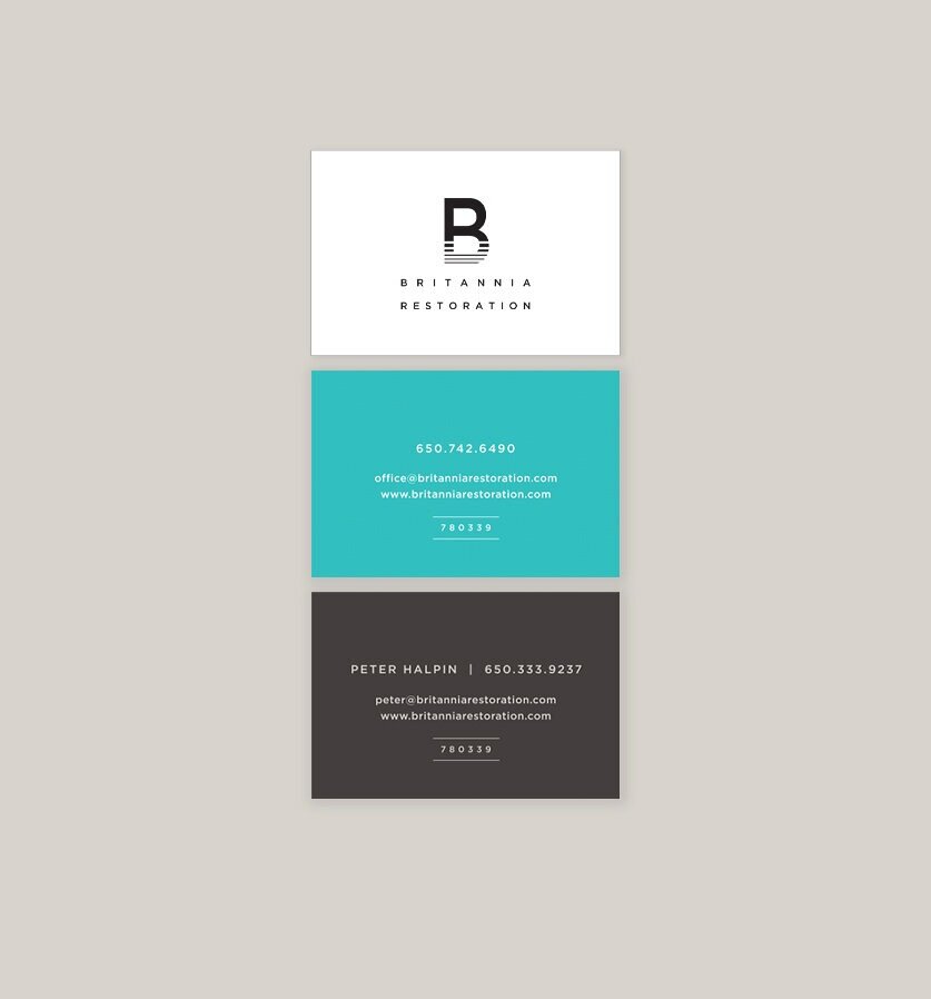
A home resotration company in the San Francisco Bay Area was looking for a branding package that needed to convey restoration after damage due to flood, fire or mold. Differentiating from a typical homebuilder look, a bold graphic direction tells the story. Logo implies building up from the foundation into a solid finished product. Both the B and R can be read in the logo.


“Nancy Campana’s creativity is amazing! She has done 2 websites and logo branding for my businesses. Our new identities and branding are awesome, very well designed and super important to my businesses. I can’t thank Campana Design enough. We feel very lucky to have found her services. I highly recommend Campana Design but honestly, her work speaks for itself!”